Note to the Examiner: When you start to play the video, click on the settings button on the bottom right corner of the video itself to change the video to the highest possible HD setting.
Showing posts with label Construction. Show all posts
Showing posts with label Construction. Show all posts
Wednesday, 23 April 2014

Ancillary Task - Digipak
These are the pages for inside the Digipak as they would need to be printed, hence why some of it is upside-down.


The exterior, folding-panel design of the entire Digipak case. The first picture shows the flat-pack version the correct way up, the second shows the interior of the Digipak the correct way up.


To show how my Digipak would look in real-life, I printed all of the above images on A3 paper, as this was the closest I could get to the actual dimensions of a Digipak without having to pay to have it professionally printed elsewhere on bigger paper or card. I have photographed the finished product from different angles to show how it would look if it could be purchased in a shop. I wanted to place an actual CD inside for added realism, but a CD is slightly too big and doesn't demonstrate the Digipak's purpose properly, hence why I kept the pictures of the CDs inside.
 |
| The Digipak as it stands up. |
 |
| Inside the Digipak with the right panel folded over. |
 |
| The open Digipak from behind. |
 |
| The back cover of the Digipak. |
 |
| The exterior of the right panel. |
 |
| Interior of the Digipak fully opened. |
 |
| Back pages of the lyric booklet. |
 |
| Middle pages of the lyric booklet. |
 |
| First few pages of the lyric booklet. |
 |
| Interior of the Digpak with the lyric booklet closed up. |
 |
| Front cover of the Digipak. |
Friday, 4 April 2014
Music Video - 1st Upload
This is the upload of my completely-finished production; Autumn Leaves by Ed Sheeran.
NOTE TO THE EXAMINER: If the annotations appear, once playing, click on the settings button in the bottom right corner of the video window to turn them off, and remember to watch in the highest HD quality available.
For the first showing of my music video to my class, I asked to receive feedback from three people:


People said that they really liked the use of black and white editing - whilst they initially felt it was quite unusual to have the whole edit in black and white - they said it worked quite surprisingly and really added to the theme of the narrative. They also liked that I used a wide variety of different locations throughout the edit which made it more interesting. The editing worked well and they especially liked the dissolve transitions to show the passing of time.
NOTE TO THE EXAMINER: If the annotations appear, once playing, click on the settings button in the bottom right corner of the video window to turn them off, and remember to watch in the highest HD quality available.
For the first showing of my music video to my class, I asked to receive feedback from three people:

Conclusively, from the feedback I have learnt that this edit of my video conforms to it's genre conventions. In terms of the genre of production - music video - the imagery fit nicely with the music, matching the rhythm and pace, whilst it also fit the genre of the music - indie/acoustic - as the use of black and white editing added emotion and a deeper sense of meaning. I also combined a nice mixture of narrative, performance and even conceptual to meet the genre of a music video.
People said that they really liked the use of black and white editing - whilst they initially felt it was quite unusual to have the whole edit in black and white - they said it worked quite surprisingly and really added to the theme of the narrative. They also liked that I used a wide variety of different locations throughout the edit which made it more interesting. The editing worked well and they especially liked the dissolve transitions to show the passing of time.
In terms of improving my video, they suggested that if I can maybe input more scenes which would add clarity to the storyline. However, my thought on my video was that I wanted it to be unclear to add ambiguity and an Enigma Code - in order to hook the audience and keep them wondering about the storyline past the point of watching it. They also noticed that there were some synching issues with the singing, which I had also identified, but I must say that these issues weren't as clear on Premiere Pro so perhaps this is more down to it being uploaded to YouTube, so I will now work to adjust this. There were also suggestions about the colour, in the sense that whilst they liked the black and white editing, I could perhaps try uploading the video in a de-saturated colour and in a sepia tone to find out what the audience prefers as it may change the way the audience decodes the performance. Also in some cases, some of the transitions may need to be faster as this may make the audience bored, and some of the filming was slightly shaky. At times, the filming was purposely shaky as it was supposed to be from the protagonist's point of view, thus it was supposedly hand-filmed. Perhaps I didn't make some of the footage shaky enough to emphasise this idea, so to fix this, I will either work on reducing the pace of the clip to make it look less shaky, or apply some sort of a filter which will emphasise this more.
Official Feedback:
Once I had completed all of my coursework, Paul gave us some feedback and marking for the entire unit. With my video especially, I have several things I need to change, which I will work on to create the final edit of my video. I need to focus on re-shooting my 'singing' sequences to make sure they sync with the music better. I also need to re-shoot the sequence where the character is walking along the grass as an iPod wire keeps falling into the shot. I may also re-shoot the 'eye' shot to make it clearer and neater, which may require slightly better lighting than last time.
Wednesday, 12 March 2014
Talent Release Forms
Talent Release form for the talent of Yasmin Watkins on the date of Wednesday 5th March 2014 at The Dashes Sports Ground (behind Harlow College). She played the female character in the music video who released the balloons:

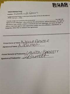
Talent Release form for the talent of NICOLA BAXTER on the date of 19th February 2014 at Woodcroft Green. She played the female character walking through the forest:
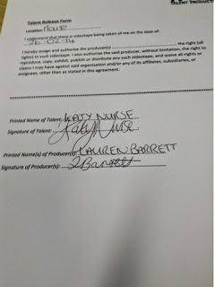
Talent Release form for the talent of KATY NURSE on the date of 26th February 2014 at The House. She played the female character singing and opening the presents/looking through the photo album:
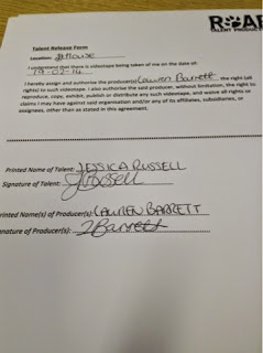
Talent Release form for the talent of Jessica Russell on the date of 19th February 2014 at The House. She played the female character in the music video who played the guitar:
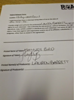
Talent Release form for the talent of Hayley Bird on the date of Sunday 24th February 2014 at Hollywood Bowl, London. She played one of the characters who went bowling:
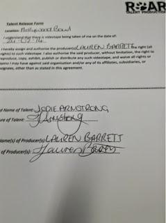
Talent Release form for the talent of Jodie Armstrong on the date of Sunday 24th February 2014 at Hollywood Bowl, London. She played one of the characters who went bowling:
Talent Release form for the talent of Sarah-Jayne Barrett on the date of Sunday 24th February 2014 at Hollywood Bowl, London. She played one of the characters bowling. She also was a part of the other London shots such as walking down the escalators.

Wednesday, 26 February 2014
Tuesday, 25 February 2014
Location Release Forms - Music Video
Below is an example of the Location Release Forms that the owners of the premises that I film in will need to complete in order to allow me permission to film.
This Location Release Form is for the location of: MY HOUSE; 25 ABBOTSWELD, HARLOW, ESSEX, CM18 6TF. This location was used for the purpose of filming the music video and for photographing some of the images for my ancillary tasks.
Now that I have completed filming, the filled-in release sheets have been photographed and uploaded below for the locations of; The House, The Bowling Alley and The Station:
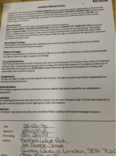
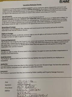

Now that I have completed filming, the filled-in release sheets have been photographed and uploaded below for the locations of; The House, The Bowling Alley and The Station:


Thursday, 13 February 2014
Production Logo
Friday, 7 February 2014
Today...
Today I started to work on some of the images I have photographed for both of my Ancillary products. Firstly, I changed the levels and curves on some autumnal images I had and then dropped them in to see which one worked best for my website background...

I decided upon the above image as I felt that the colours were really rich and reflective of the theme of my song, 'autumn' whilst the colour is still quite neutral and doesn't lean more towards a male or a female target audience.
Then I began work on the 'hands' photos I shot last lesson. Purposely, I asked my model to position her hands in a very similar way to how the hands were in the mock-up photo I used, purely because I felt like this was reflective of the title of the album. The album, titled '+' is often pronounced by fans as either 'plus' or 'positive'. I felt that the use of 'open' hands reflected on this idea of happiness and positivity, whilst more closed hand gestures would have connoted a negative, sad emotion. With my model I asked her to wear an orange/burnt sort of colour on her nails as this would then also reflect on the autumnal feel of my design.
 |
| Internet Image |
 |
| My Image |
Wednesday, 5 February 2014
Ancillary Task Photoshoots
Shoot 1: Forest/Autumn Scene: For both my website and my Digipak, I need various different shots of trees, leaves etc. to use as background images. To represent the natural themes to the song and the album as a whole, I want nature to be a big feature with my ancillary tasks in order to reflect the style of the music. Requirements: Location: Park behind college; forest opposite Asda. People: N/A. Hair, make-up, costume: N/A. Lighting: bright and natural, plenty of sunlight to enhance strong colours. Shots needed: plenty of close-ups of leaves, branches etc. Long shots to capture the entire location 'establishing'.
Resultant images:


 |
| For this image, I edited the levels and curves like I would any normal photo, but then I also adjusted the saturation and brightness to bring out and enhance the natural colour of the leaves more. The leaves weren't as autumnal as I had hoped, so I then applied a Photo Filter to my photo, a slight orange colour, to give the image more warmth and the appearance of a true autumnal sunset. This image may make up part of my website and my Digipak. I V  |
Shoot 2: Hands: For the front cover of my Digipak, I want a shot of a girl's open hands to represent the idea of happiness and positivity which is reflected in the title of the album, '+' which is often pronounced by fans as either 'plus' or 'postitive'. The overall vibe for the album is quite happy, positive but mixed with emotion, hence why I wanted to use the hands as a symbol for the front cover. This idea came a lot from my research of Digipaks, and I was inspired by the artwork for The Script's second album 'Science and Faith'. On their album cover are two people holding hands, symbolic of relationships and power which is heavily featured within their songs. Also, with the artwork for their singles from said album, the same hands feature but in different positions/gestures to represent different themes in the songs, which I think is a really effective idea and builds a sense of brand identity. Requirements: Location: Studio, black background up. People: Rhiannon; she has very pale/fair skin which I felt was perfect for representing the idea of purity. Hair, make-up, costume: N/A. Lighting: Studio lights close up to the subject to show shadows and highlights. Also to show contrast against background to make editing easier. Shots needed: Close-ups of the hands with the hands in a slight cupped position.
Said Inspiration:


Resultant images:

Shoot 3: Nature/textures: For the Digipak insert, I wanted a variety of different images for the backgrounds of each page to also show the change in song from page to page. However, with different images, I wanted to also have a recurring theme so that every piece of design work for this project interlinked and created a sense of brand identity. For this shoot I basically wanted to shoot some close-up shots of various flowers, plants, leaves etc to make subtle backgrounds for each lyric page. It didn't matter what colour the subject was as I will change them to black and white during the editing process anyway.
Resultant images:


Shoot 4: Website images and merchandise: For the website I want every page and element to work and be realistic. Therefore, I wanted some images of merchandise and relating objects to place as icons for various pages on the website, as well as for the 'merchandise' page. I know that I myself have some Ed Sheeran merchandise at home, as well as a guitar, so I will photograph them in clear, close-up shots to follow showcase the subject - shots that won't require much editing and will fill most of the frame.
Resultant images:

Subscribe to:
Posts (Atom)