
Showing posts with label Website. Show all posts
Showing posts with label Website. Show all posts
Wednesday, 23 April 2014
Wednesday, 12 March 2014
Talent Release Forms
Talent Release form for the talent of Yasmin Watkins on the date of Wednesday 5th March 2014 at The Dashes Sports Ground (behind Harlow College). She played the female character in the music video who released the balloons:

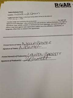
Talent Release form for the talent of NICOLA BAXTER on the date of 19th February 2014 at Woodcroft Green. She played the female character walking through the forest:
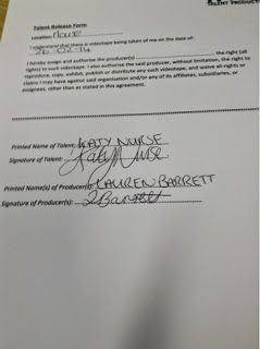
Talent Release form for the talent of KATY NURSE on the date of 26th February 2014 at The House. She played the female character singing and opening the presents/looking through the photo album:
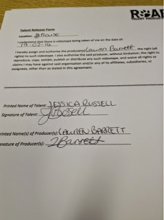
Talent Release form for the talent of Jessica Russell on the date of 19th February 2014 at The House. She played the female character in the music video who played the guitar:
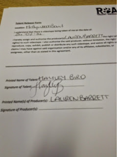
Talent Release form for the talent of Hayley Bird on the date of Sunday 24th February 2014 at Hollywood Bowl, London. She played one of the characters who went bowling:
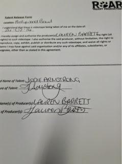
Talent Release form for the talent of Jodie Armstrong on the date of Sunday 24th February 2014 at Hollywood Bowl, London. She played one of the characters who went bowling:
Talent Release form for the talent of Sarah-Jayne Barrett on the date of Sunday 24th February 2014 at Hollywood Bowl, London. She played one of the characters bowling. She also was a part of the other London shots such as walking down the escalators.

Tuesday, 25 February 2014
Location Release Forms - Music Video
Below is an example of the Location Release Forms that the owners of the premises that I film in will need to complete in order to allow me permission to film.
This Location Release Form is for the location of: MY HOUSE; 25 ABBOTSWELD, HARLOW, ESSEX, CM18 6TF. This location was used for the purpose of filming the music video and for photographing some of the images for my ancillary tasks.
Now that I have completed filming, the filled-in release sheets have been photographed and uploaded below for the locations of; The House, The Bowling Alley and The Station:
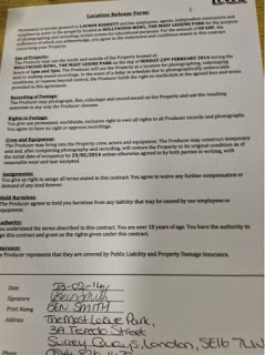
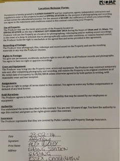

Now that I have completed filming, the filled-in release sheets have been photographed and uploaded below for the locations of; The House, The Bowling Alley and The Station:


Thursday, 13 February 2014
Main Influences
Along my journey of research and planning for my three products; music video, Digipak and website, I have been influenced by various existing products to help me enhance and develop my creativity.
To start with, I looked at existing videos by my chosen musician, Ed Sheeran, to gain influence from his existing products and to develop a realistic sense of branding with my own music video. My two favourite videos of his were The A Team and Give Me Love:
These two videos were the most simplistic of all of his videos, which is what I like and want to apply to my own work. Although quite simple, they're both very artistic in the ways that they portray the lyrics, whilst a few of his other videos are more comical and are created for the purpose of entertaining, whilst these are here to tell a story, which is what I want to also portray for my song. I think the dark and 'grundgy' colours work well in these videos as they give them a serious tone, furthermore helping to portray the emotion and story of the lyrics, so this is likely to influence me to use darker, neutral colours within my music video.
Production Logo
Friday, 7 February 2014
Today...
Today I started to work on some of the images I have photographed for both of my Ancillary products. Firstly, I changed the levels and curves on some autumnal images I had and then dropped them in to see which one worked best for my website background...

I decided upon the above image as I felt that the colours were really rich and reflective of the theme of my song, 'autumn' whilst the colour is still quite neutral and doesn't lean more towards a male or a female target audience.
Then I began work on the 'hands' photos I shot last lesson. Purposely, I asked my model to position her hands in a very similar way to how the hands were in the mock-up photo I used, purely because I felt like this was reflective of the title of the album. The album, titled '+' is often pronounced by fans as either 'plus' or 'positive'. I felt that the use of 'open' hands reflected on this idea of happiness and positivity, whilst more closed hand gestures would have connoted a negative, sad emotion. With my model I asked her to wear an orange/burnt sort of colour on her nails as this would then also reflect on the autumnal feel of my design.
 |
| Internet Image |
 |
| My Image |
Wednesday, 5 February 2014
Ancillary Task Photoshoots
Shoot 1: Forest/Autumn Scene: For both my website and my Digipak, I need various different shots of trees, leaves etc. to use as background images. To represent the natural themes to the song and the album as a whole, I want nature to be a big feature with my ancillary tasks in order to reflect the style of the music. Requirements: Location: Park behind college; forest opposite Asda. People: N/A. Hair, make-up, costume: N/A. Lighting: bright and natural, plenty of sunlight to enhance strong colours. Shots needed: plenty of close-ups of leaves, branches etc. Long shots to capture the entire location 'establishing'.
Resultant images:


 |
| For this image, I edited the levels and curves like I would any normal photo, but then I also adjusted the saturation and brightness to bring out and enhance the natural colour of the leaves more. The leaves weren't as autumnal as I had hoped, so I then applied a Photo Filter to my photo, a slight orange colour, to give the image more warmth and the appearance of a true autumnal sunset. This image may make up part of my website and my Digipak. I V  |
Shoot 2: Hands: For the front cover of my Digipak, I want a shot of a girl's open hands to represent the idea of happiness and positivity which is reflected in the title of the album, '+' which is often pronounced by fans as either 'plus' or 'postitive'. The overall vibe for the album is quite happy, positive but mixed with emotion, hence why I wanted to use the hands as a symbol for the front cover. This idea came a lot from my research of Digipaks, and I was inspired by the artwork for The Script's second album 'Science and Faith'. On their album cover are two people holding hands, symbolic of relationships and power which is heavily featured within their songs. Also, with the artwork for their singles from said album, the same hands feature but in different positions/gestures to represent different themes in the songs, which I think is a really effective idea and builds a sense of brand identity. Requirements: Location: Studio, black background up. People: Rhiannon; she has very pale/fair skin which I felt was perfect for representing the idea of purity. Hair, make-up, costume: N/A. Lighting: Studio lights close up to the subject to show shadows and highlights. Also to show contrast against background to make editing easier. Shots needed: Close-ups of the hands with the hands in a slight cupped position.
Said Inspiration:


Resultant images:

Shoot 3: Nature/textures: For the Digipak insert, I wanted a variety of different images for the backgrounds of each page to also show the change in song from page to page. However, with different images, I wanted to also have a recurring theme so that every piece of design work for this project interlinked and created a sense of brand identity. For this shoot I basically wanted to shoot some close-up shots of various flowers, plants, leaves etc to make subtle backgrounds for each lyric page. It didn't matter what colour the subject was as I will change them to black and white during the editing process anyway.
Resultant images:


Shoot 4: Website images and merchandise: For the website I want every page and element to work and be realistic. Therefore, I wanted some images of merchandise and relating objects to place as icons for various pages on the website, as well as for the 'merchandise' page. I know that I myself have some Ed Sheeran merchandise at home, as well as a guitar, so I will photograph them in clear, close-up shots to follow showcase the subject - shots that won't require much editing and will fill most of the frame.
Resultant images:

Tuesday, 14 January 2014
Website Mock-Up; Progress
As I cannot post a link to the website I am creating until it is completely finished and published, I am going to update this post with screenshots to show my progress with the product. At the moment I am just doing the basic layout for the website, placing all of the necessary text boxes and experimenting with colours, images etc.
At the moment I am using images available for use on Wix and images I have saved from the internet in order to gain a clear idea as to how the final piece will look. All of the text at the moment is being copied and pasted from a different source, but I will eventually write my own content once I am happy with the mock-up layout.


At the moment I am using images available for use on Wix and images I have saved from the internet in order to gain a clear idea as to how the final piece will look. All of the text at the moment is being copied and pasted from a different source, but I will eventually write my own content once I am happy with the mock-up layout.
------------------------------------------
10.01.14
This is the home page so far:


Biography:

News:

Live Dates:

Wednesday, 8 January 2014


Wednesday, 11 December 2013
Target Audience Research
When I come to produce my ancillary task products alongside my main product, it is essential for me to consider my target audience as a whole to ensure that they are successful in promoting the music video (main product). I have set a basic target audience profile for the music video on the basis of the basic research I have so far conducted, and this will also follow-through with my production of the ancillary tasks as I will be more-or-less targeting the exact same people. However, because of the location and distribution of said ancillary products, the target audience for each one might change slightly.
For example, the link that I have posted below takes you to a blog post written by Jay Frank, where he states that 61% of online books, music and video are purchased by women, which suggest that my website will have to take a slightly more feminine approach, whereas over 2/3 of Top Single Download purchases were of artists with a female majority fanbase, which suggests that women are more likely to download music from sites such as iTunes, whereas men prefer the idea of going into a store and purchasing a physical copy, which might suggest that my Digipak has to be aimed more at the men that make up my target audience.
My general target audience is:
This children's website for example attracts it's target audience with the use of bold shapes and patterns, as well as strong colours. The target audience is clearly females because of the use of pink and purple colours.


My general target audience is:
- Men/Women 40%/60%
- 16 - 24
- Festival go-ers
- Play live music/guitars
- Quiet, calm personalities
- College and Uni students
- Ed Sheeran fans
- People based in England and America mostly
- Very few people above and under the age-range stated above.
- The people in this target audience make good friends
- Hobbies include going bowling, shopping and photography
This children's website for example attracts it's target audience with the use of bold shapes and patterns, as well as strong colours. The target audience is clearly females because of the use of pink and purple colours.
An information website, such as the BBC, uses a set colour scheme which usually contains no more than three main colours to not discriminate against anyone. However the lack of colour in comparison to the first website makes it look more professional and suitable for an older target audience.

Summary of my Audience Research:
Bibliography:
Subscribe to:
Posts (Atom)